Art All Day has been the clever companion to Art All Night. Early on, the branding did have companionship – Art All Night had a moon in the logo, and Art All Day had a sun. As both festivals grew, the need for a simplified, multi-use logo was discussed. It is a tricky domain, as the organization, Artworks can take second priority to the event. Over the years we have managed to organize the priority and balance with messaging and promoting.
As simple as it is, a logo has to work in black and white, and reversed to accommodate all instances and placement in print and on screen. Typically, about a dozen formats are labelled and delivered for all the uses.
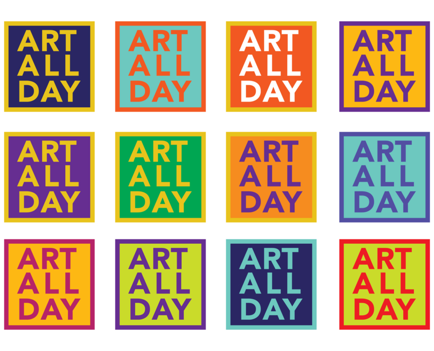
Periodically, we lay out a few color ways to pick which colors might be the colors for that year. The Art All Day has established itself as the brand. With partnerships and collaborations we have to have flexibility with the logo.


